Erez Marom Photography
Article: Art of the Unforeground
Posted on 23rd November, 2014 - Back to Blog Listings
“It’s all about the foreground”. Generations of landscape photographers learn this principle the moment they first pick up a camera. Indeed, in classic landscape photography the foreground element is usually the dominant component of an image, and serves it in many forms. The foreground connects us to the photographer’s immediate environment by attracting the viewer to look at it. This eye-drawing quality stems from the fact that the foreground element is usually preferred to be massive (and is also inflated by the proximity to the lens), particularly detailed and interesting and also separated from the other image components. In addition, the background, when added to the background, contributes to the feeling of depth in the two-dimensional medium of photography. I always advise photographers to put a large emphasis on the qualities and location of the foreground element.
But what if the very essence of the foreground were its nonexistence - or at least its extreme subtlety? What if the dissolution of the all-important element gave us more than its inclusion? I’m not talking about faraway landscapes without foregrounds. These are a different story altogether, and the lack of foreground is granted. What I’m talking about is images which have room for foreground, but whose massive, detailed, classical foreground element is missing, thus achieving a special feel- and an understanding that the exclusion of something so prominent can lead you to fascinating grounds.
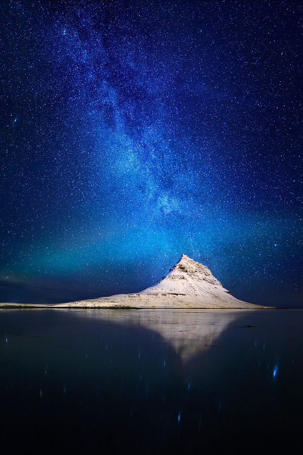
Both images included here are good examples of what I'm trying to say. The first shows the Pyramid Mountain, Kirkjufell, in the Snæfellsnes Peninsula, west Iceland. Some might say that the mountain itself is the foreground, but that’s just not true. It’s too far away, too much a part of the background, even more so since it integrates so well with the Milky Way and Aurora above it. The foreground consists of mainly nothing – joined by a few reflections of stars here and there. I claim that it’s this very near-nothingness that gives the image its unique, spacey feel. The fact that there seems to be nothing (or just stars, or water without any measure of its depth, put it how you choose) underneath the viewer makes him feel lost in space, and so that is how I named the image (see more about 'Lost in Space here).
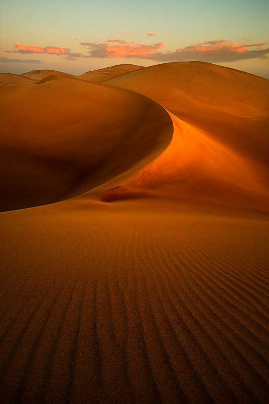
The second image, shot in the deserts of Huacachina, Peru, conveys my point perhaps even better. A whole lot is going on in the background: three sand dunes topped by three clouds matching the perfectly in location and size, beautiful curves and light – praise the heavens for this incredible stroke of luck! But this image wouldn't be one of my favorites without its blatant unforground. Again, there’s almost nothing going on in the lower half of the shot- and that’s the whole point. The visual dissonance of faint, subtle lines make the viewer feel perhaps uncomfortable, forcing him to look a bit longer and harder and to appreciate the composition, as well as the details of the image, more.
Again, you may rightfully claim that the rippled sand is, in fact, the foreground element. And you'd be correct from a certain point of view. My only point is that the fact that the foreground doesn't include a well-defined, massive element contributes to the image in the way described here.
The unforground is a powerful compositional tool. Try using it, and see it’s not all that easy. But when it works, it can make your image unforgettable- or at least, make people look at it a few seconds more.


