Erez Marom Photography
Article: Composition Basics in Macro Photography
Posted on 7th August, 2014 - Back to Blog Listings
A lot has already been said about composition. Every aspiring photographer knows about the rule of thirds, about the appeal of diagonal lines and about the rule of lead room. I can't fully discuss composition in one or two articles, nor do I think it's necessary in a specialized series about macro. Yet I do plan to mention a few points, emphasize and exemplify the application of compositional rules to macro, and, in addition – talk about elements which are more prominent in macro than in other areas, and thus need special consideration. I will also use plenty of examples, as this is critical in getting the hang of composition.
I have already mentioned point of view as a critical aspect of composition in macro photography. Shooting from the same point and height as the subject of view as the serves to create the feeling of closeness which is so important in wildlife imagery. I will not discuss this further in this article.
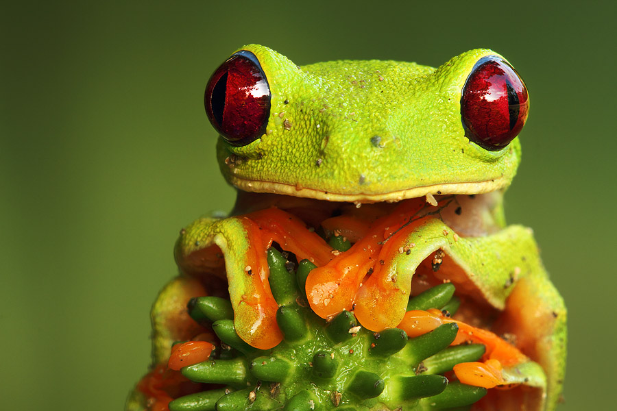
The rule of lead room is important in macro, as it is in all areas of wildlife photography. This rule states that a frame should contain extra space in the direction where the subject's eyes are looking. Indeed, having a subject looking at the edge of the frame is unappealing. But this specific rule is but one among many ideas referring to the more general notion of balance in the image. I'll try to list the guidelines I see as most useful.
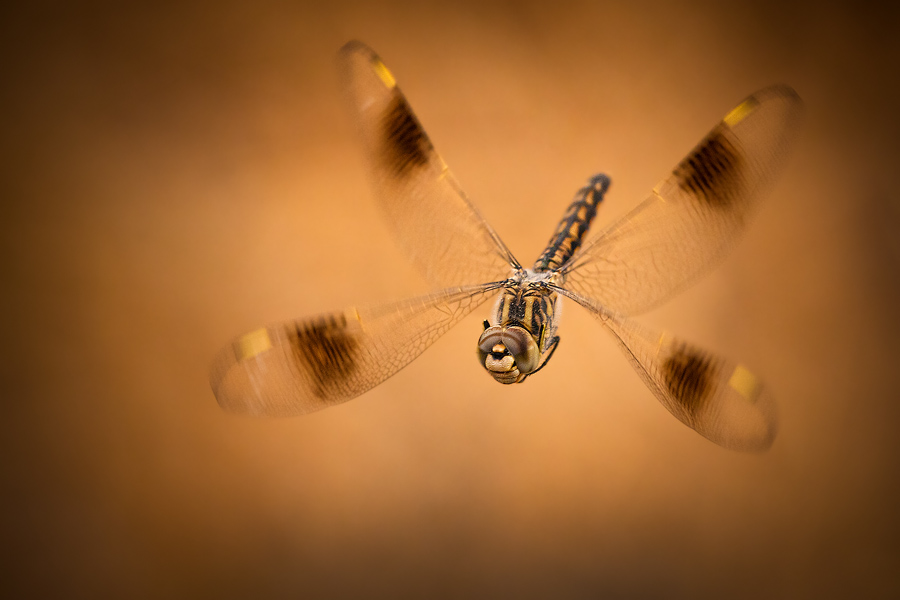
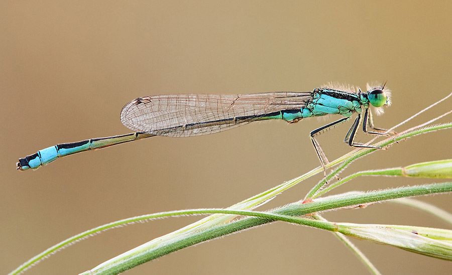
The idea of lead room can be extended into a rule that's better fitting to macro: one doesn't only need to leave more room in the direction of the eyes compared to the opposite direction, but the amount of room should take into account the shape and body structure of the subject. In macro, lots of subjects have very long and narrow abdomens, for example damselflies, which are extremely "front heavy". Leaving a normal amount of lead room isn't enough to balance a damselfly's shape, but since the damselfly is so long, it's very easy to get tempted into filling the frame with it. One could say that the center of mass of the subject should be used as the reference point utilized to apply the rule of lead room, rather than the whole subject.
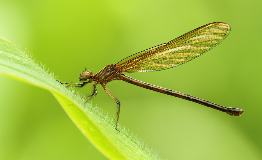
The Rule of Thirds plays a similar role in macro as in other types of photography, and offers another guideline to maintain balance. Most of my images are either centered or follow the rule of thirds - this usually depends of whether the subject is looking straight at the camera or to either side.
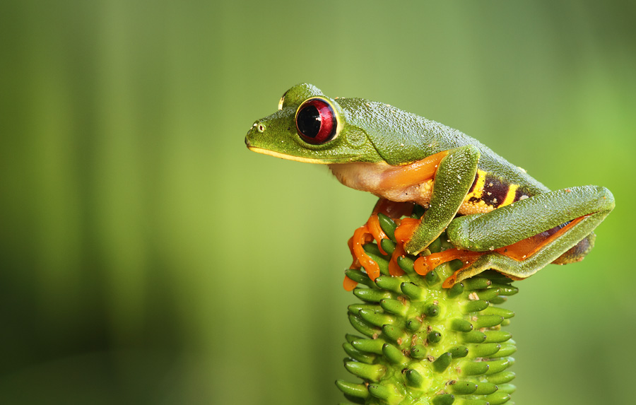
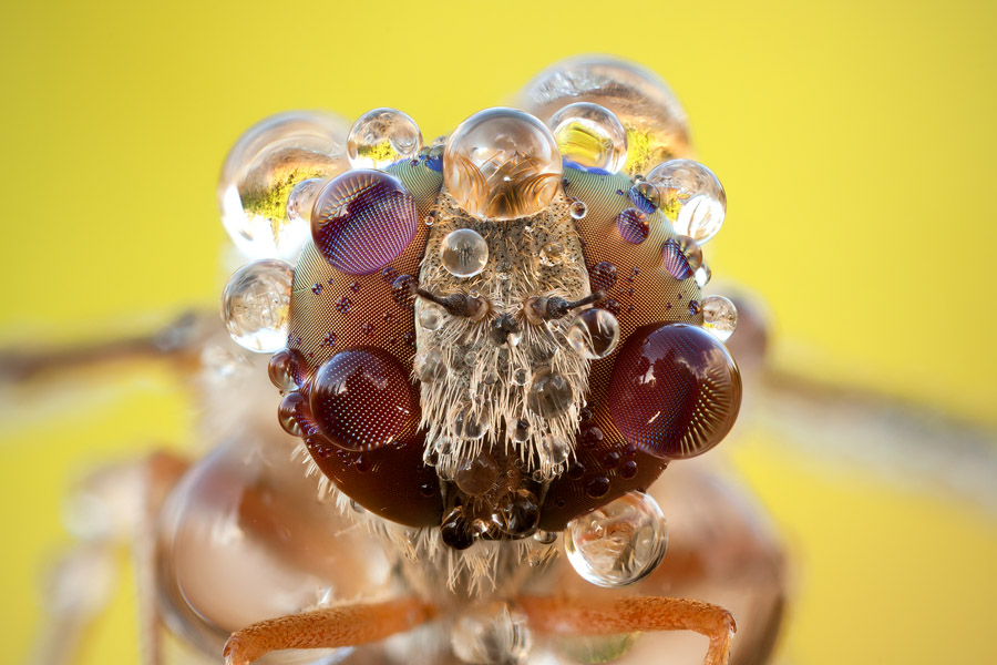
Another important thing to bear in mind is that having the major lines in the image parallel to the edges is often unappealing. Try to give your images diagonals, and they will benefit greatly.
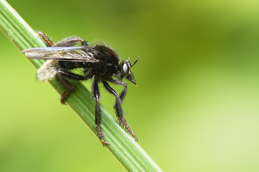
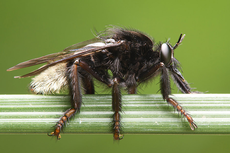

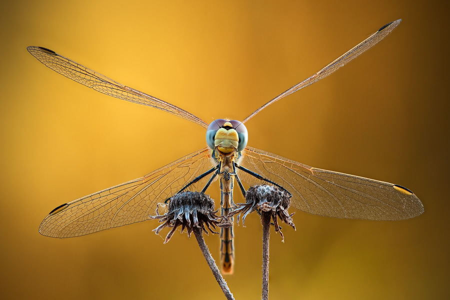
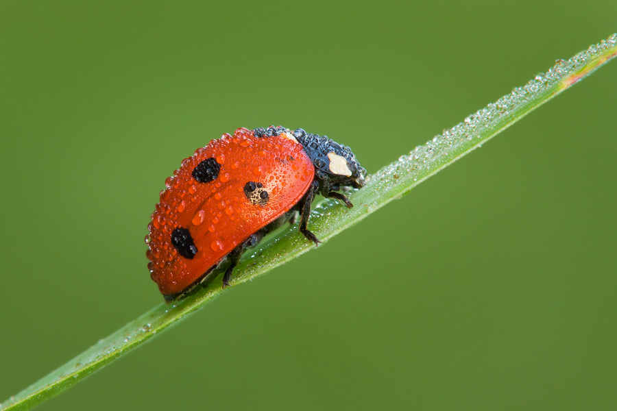
When shooting invertebrates in the classic "animal standing on a diagonal plant" pose, try not to have the plant cross the image from corner to corner. The subject itself has compositional weight, and to balance it the plant should cross the frame's edges at a lower point.
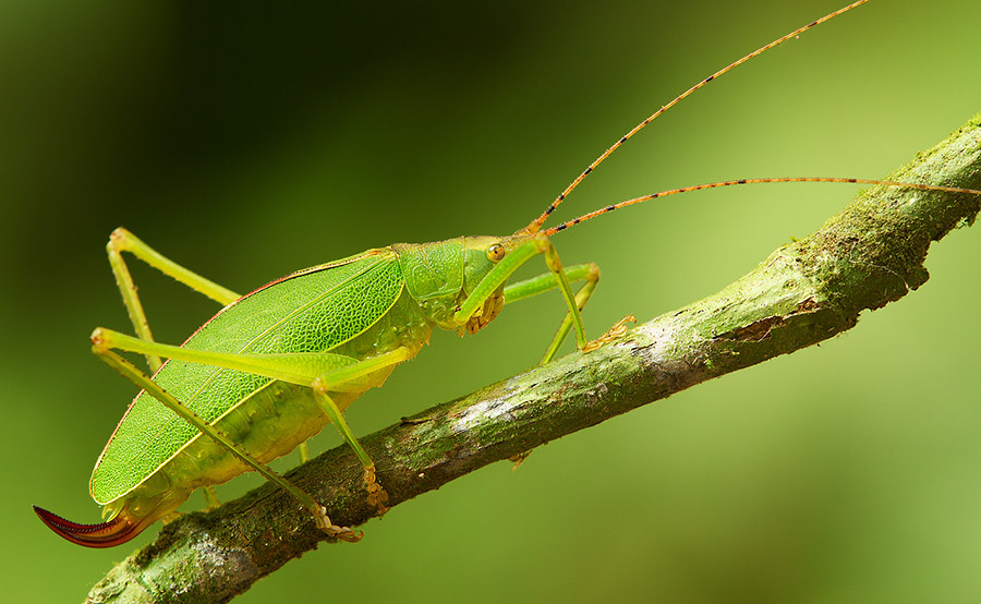
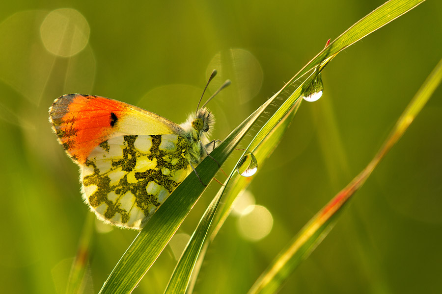
The amount of distance from the corner-to-corner diagonal should depend on the compositional weight of the subject.
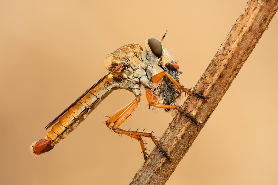
Another very important guideline is cut hard or don't cut at all.
It’s often problematic to include the whole macro subject in a frame. Insects sometimes have very long antennae, and so including the whole body necessarily means shooting it using a relatively small magnification ratio. This often contradicts our wish to obtain good detail in the subject’s body, so we sometimes compromise and cut just ‘some’ of it protruding body parts. This can seriously hurt the balance in the image, leaving us with neither good composition nor good detail. My advice is that if you find long body parts too obstructive, just get as close as you need without caring about cutting them off. You’ll sometimes get a very good, detailed and balanced result even if you leave a large portion of the subject out of the frame.
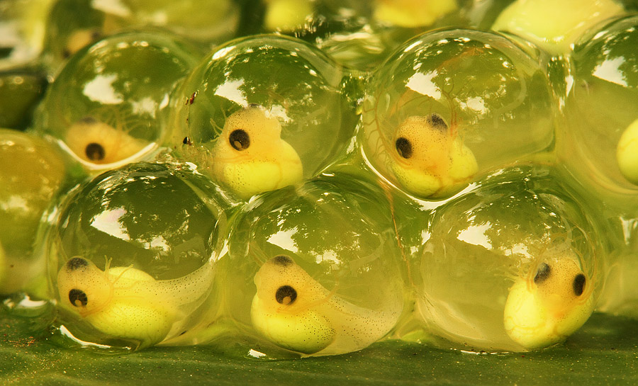
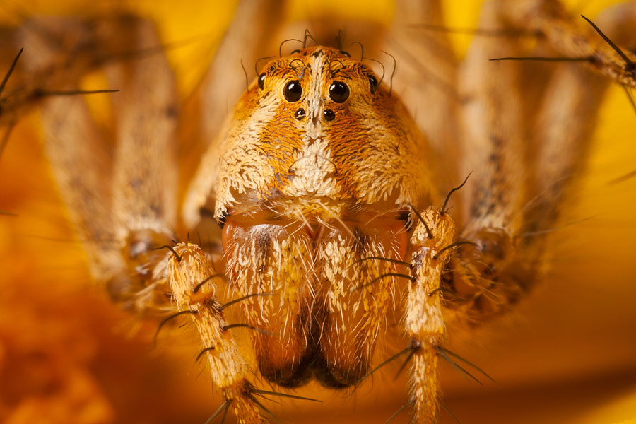
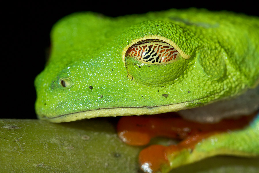
Lastly, it’s extremely important to stress that these rules are meant to be broken. Experiment with composition, try unusual methods and feel free to ignore conventions. But, and this is a big but, always mean what you do and be thoughtful of it. This is what art is all about.
