Erez Marom Photography
Article: What We Want in a Macro Shot - Background
Posted on 24th July, 2014 - Back to Blog Listings
In the previous article, I talked about the importance of detail in macro photography. But this rather technical aspect can't be all that's important, so in this article and the next I'll go through several less technical, yet equally significant issues.
The first topic I wish to address is Background.
Arguably as important as the subject itself, the background can have a huge impact on a macro shot. Photographers of all fields use the background to emphasize the subject and to connect it to its environment. The background has many qualities such as the amount of blur, the brightness and saturation levels and the colors and shapes visible in it. The same subject will not look the same with different backgrounds, and the photographer must not only remember all this, but use it to his advantage in the field.
While this is true in all fields of photography, our treatment of the background issue is quite different when shooting macro. Let's look at the following two images.
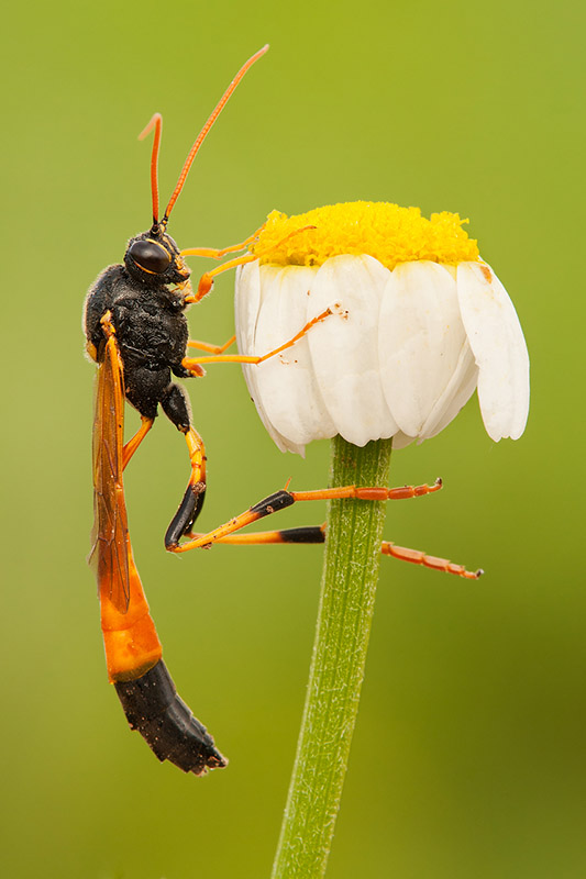
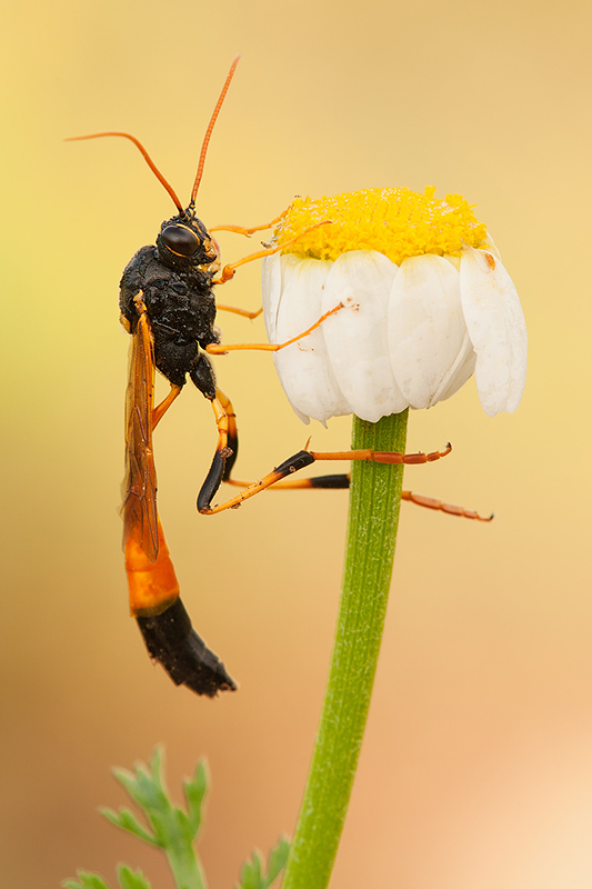
As can be seen in the first image, I shot this beautiful wasp from about eye level. The color of the background is due to the green vegetation behind the wasp. For the second shot, I stayed in the very same place, but extended the tripod's legs by a few centimeters to get slightly higher. The (perhaps unexpected) result is a similar image, only with a very different, earth-colored background. How is this achievable with such a slight movement? Let's think about a different scenario: If one shoots a street scene, say a man standing in front of a wall, moving the camera slightly would change the image a bit, but it wouldn't significantly alter the background. Yet in our above example, a movement of a few centimeters changed the background altogether. This, again, is a consequence of shooting from a close distance, and of the fact that the relation between background distance and subject distance is extremely large. I like to say that in macro, everything revolves around the subject, and so a tiny change in camera position compels a large angular change in the direction of shooting, and the closer you get - the larger the change.
Most importantly for our matter, the change in direction has a great effect on the background and thus on the image. This unique quality is both a blessing and a curse. A curse – because it means that shooting a subject with the background of our choice requires work and attention. If, in the wasp example above, I wanted the wasp to have the position of the first image with the background of the second – I'd have a problem on my hands which would need consideration in the field. A blessing – because if one learns and utilizes control, one has virtually infinite possibilities to create a beautiful background, one that supplements and emphasizes the subject, and serves to link it to its natural habitat.
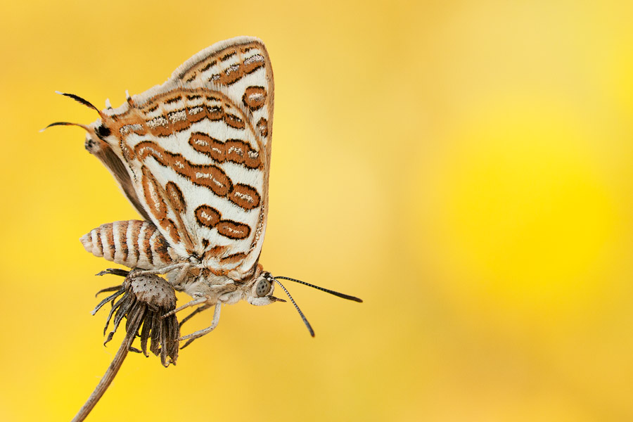
While in macro the background is relatively blurry (due to low DOF), personal taste in backgrounds varies greatly between individuals. Some photographers like a very smooth and even background. On the other extreme lie those who love "busy" backgrounds, with lots of details, shapes and colors. Personally I'm somewhere in the middle: when a subject is rather large and dominant in the image, I usually find a smoother background better fitting, since it doesn't take much attention away from the subject. Yet I try to give my backgrounds gradients – either of brightness (as in the first wasp image above) or of color (as in the second). Conversely, when the subject is quite small, I usually find a smooth background too dull, and turn to a much busier appearance.

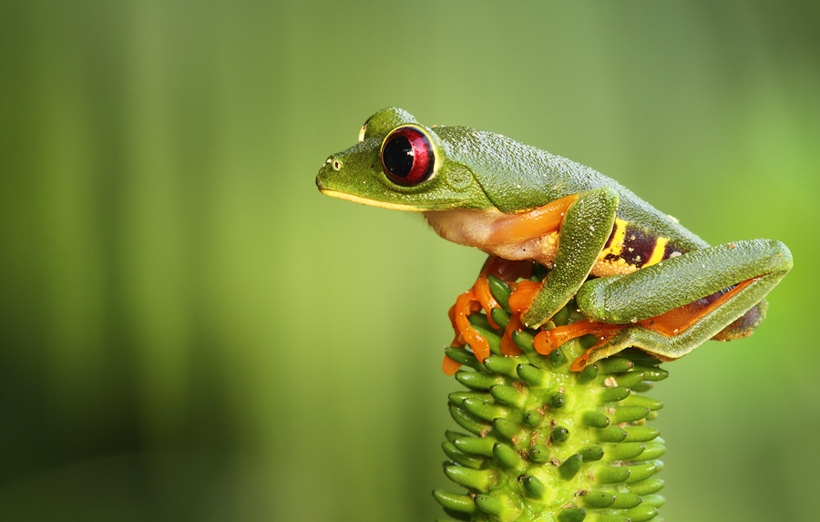
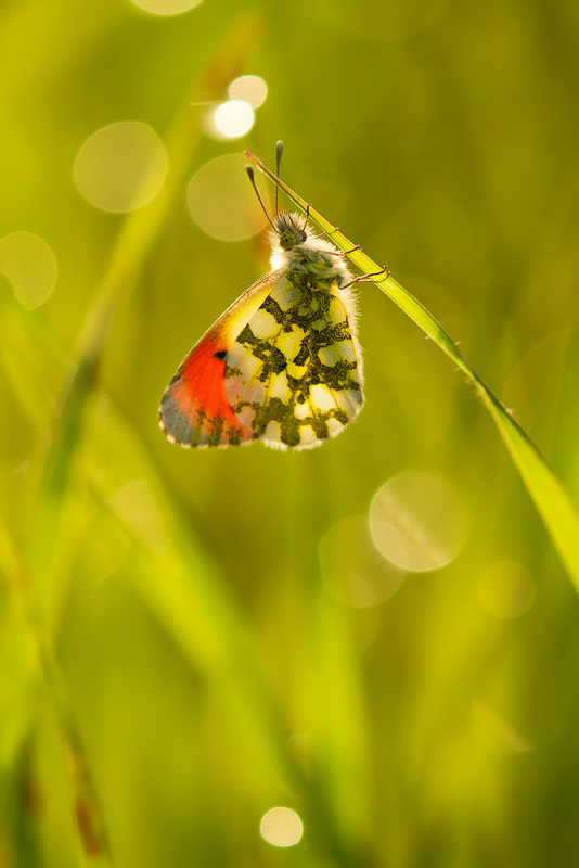
I wish to clarify that the above guidelines are by no means rules, and shouldn't be treated as such. I'm a strong believer in dealing with every image in its own right and deciding on the background regardless of other considerations, and so I break the rules and try to be creative all the time, as should you.
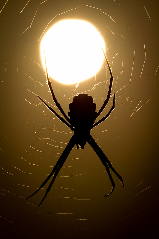
Before getting to the "how" part, I wish to discuss two more ideas regarding the contrast between background and subject. The color of the background is, as one would imagine, significant in emphasizing the subject. But how is this done? I'd like to examine two methods particularly. The first method is to use a background color which is the complementary color to that of the subject, or at least very different. This naturally brings out the subject and emphasizes its colors. But background with very similar colors to that of the subject can work equally well, giving a very natural feeling of assimilation. This works especially well with camouflaged animals. It's very important to note that I use natural backgrounds exclusively, never any studio backgrounds or any other artificial materials. Luckily for us, nature offers fantastic colors without needing any help.

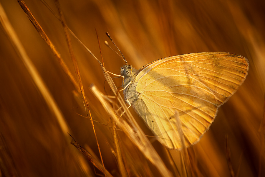
A related issue is the brightness level of the background. Again, a background having similar brightness to that of the subject creates less contrast in comparison to a background which is brighter or darker. Yet I wish to emphasize that I try to refrain from creating a background which is too bright or too dark, since that throws the image out of balance and harms it.
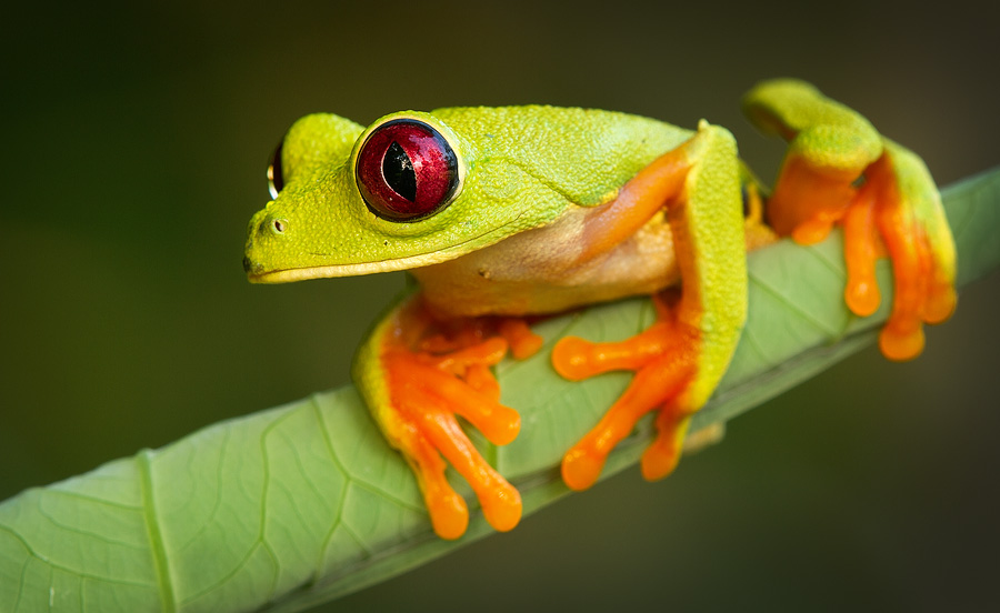
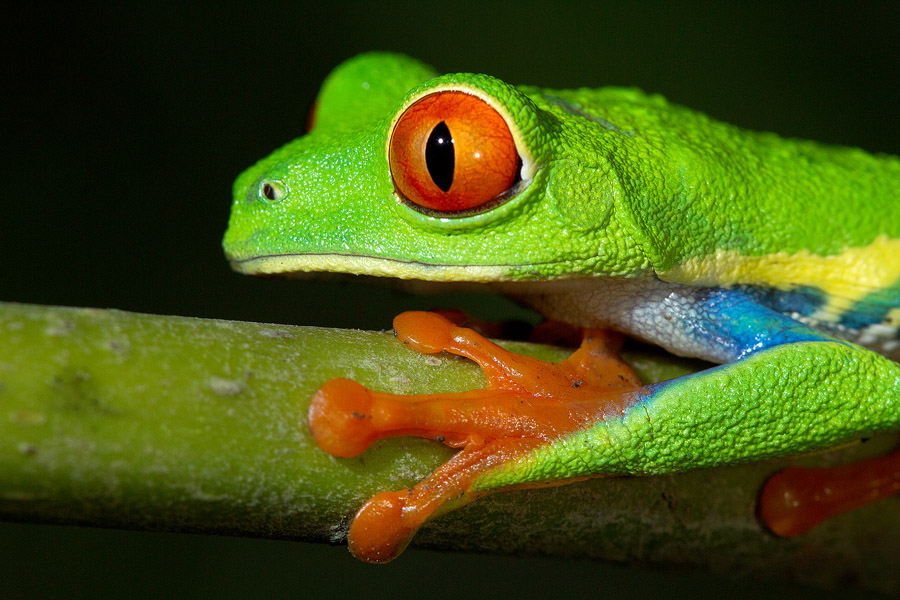
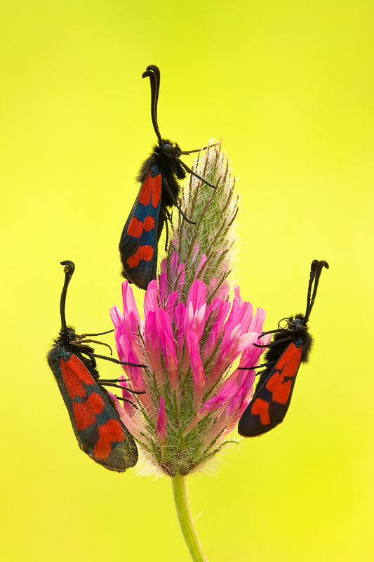
While we are still in the "what" part of the series, I feel obligated to briefly talk about how we obtain the background we want. Fortunately, one simple idea can be applied to all aspects of background mentioned above. This idea is background control: by considering the colors, brightness, shapes and textures in front of which we shoot, and combining those with the ability to select the degree of blur and the angle of view, we can achieve almost any background we desire. In the field, this consideration must be translated into actively seeking and selecting the background in front of which we shoot.


The desired degree of background blur can be achieved by controlling the distance to the background, together with DOF selection, which we'll talk about later on. But another critical issue remains unaddressed for now: shooting in front of our chosen background sometimes requires us to persuade the subject into switching locations.
